
Why do some apps feel effortless while others leave you frustrated? The difference often lies in invisible rules — the usability heuristics that great designers follow without even realizing it. These principles, first outlined by usability pioneer Jakob Nielsen, continue to shape our digital experiences decades after their introduction.
In this guide, we’ll explore how Nielsen’s 10 usability heuristics remain remarkably relevant in 2025, especially as we navigate AI interfaces, automation, and increasing digital complexity. Whether you’re a seasoned UX designer or just beginning your journey, these foundational principles will help you create interfaces that truly think like your users.
What Are Jakob Nielsen’s 10 Usability Heuristics?
Jakob Nielsen and Rolf Molich first introduced usability heuristics in 1990, with Nielsen refining them in 1994 after analyzing hundreds of usability problems. Despite our rapidly evolving technological landscape, these principles have remained essentially unchanged for over 30 years — a testament to their fundamental nature.
These aren’t rigid rules but rather flexible guidelines that help designers evaluate and enhance user interfaces. They address core aspects of human-computer interaction that transcend specific technologies or trends.
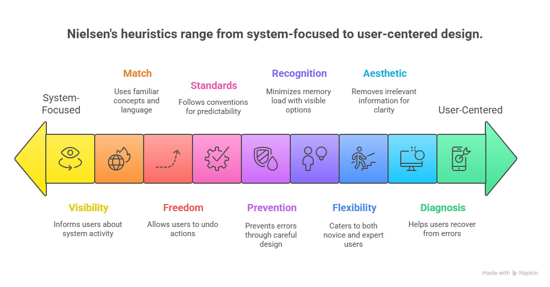
💡 1. Visibility of System Status
The system should always keep users informed about what is going on, through appropriate feedback within a reasonable time.
Users need to understand what’s happening at all times. When they take an action, the interface should acknowledge it immediately, showing that the system is responsive and working as expected.
Modern Examples:
- Progress bars during file uploads or downloads
- “Order confirmed!” notifications in e-commerce
- Typing indicators in messaging apps
- Battery percentage indicators on devices
Why It Matters Today: With AI-powered systems performing complex operations behind the scenes, clear status indicators are more important than ever. Users need to know when an AI is “thinking” or processing information.
🧭 2. Match Between System and the Real World
The system should speak the users’ language, with words, phrases, and concepts familiar to the user, rather than system-oriented terms.
Digital interfaces should mirror real-world conventions and use language that feels natural to users. This creates intuitive experiences that don’t require extensive learning.
Modern Examples:
- Trash bin icons for deleting files
- Shopping cart metaphors in e-commerce
- Calendar apps that resemble physical calendars
- Slider controls that mimic physical switches
“The best interfaces are those that feel invisible because they match our mental models so perfectly.”
🔍 3. User Control and Freedom
Users often choose system functions by mistake and will need a clearly marked “emergency exit” to leave the unwanted state.
People make mistakes. Good interfaces acknowledge this reality by providing clear ways to undo actions, go back, or cancel operations without penalty or friction.
Modern Examples:
- “Undo send” in Gmail
- Browser back buttons
- Cancel options during multi-step processes
- Edit options after posting content
AI Application: As AI systems make more decisions on users’ behalf, providing clear ways to override, adjust, or reverse automated actions becomes increasingly important.
🧠 4. Consistency and Standards
Users should not have to wonder whether different words, situations, or actions mean the same thing. Follow platform and industry conventions.
Consistency creates predictability, which reduces cognitive load. When interfaces behave consistently both internally and with established conventions, users can focus on their tasks rather than figuring out how things work.
Modern Examples:
- Hamburger menus for navigation
- Blue text indicating clickable links
- Consistent icon usage across platforms
- Standard placement of navigation elements
Jakob’s Law: Users spend most of their time on other sites. This means that users prefer your site to work the same way as all the other sites they already know.
⚠️ 5. Error Prevention
Even better than good error messages is a careful design which prevents a problem from occurring in the first place.
Anticipating potential mistakes and designing to prevent them creates smoother user experiences. This can be achieved through constraints, confirmations, and smart defaults.
Modern Examples:
- Confirmation dialogs before permanent deletions
- Form field validation as users type
- Disabling unavailable options
- Autosaving to prevent data loss
“Good error prevention doesn’t just avoid frustration—it builds trust by showing users you’ve anticipated their needs.”
🎯 6. Recognition Rather Than Recall
Minimize the user’s memory load by making elements, actions, and options visible. The user should not have to remember information from one part of the interface to another.
Human short-term memory is limited. Good interfaces make options visible and provide context, reducing the need for users to remember information as they navigate.
Modern Examples:
- Dropdown menus showing past searches
- Recently viewed items in e-commerce
- Autocomplete in search fields
- Visible navigation breadcrumbs
AI Enhancement: Modern AI can help predict what users might need next, further reducing cognitive load by surfacing relevant options at the right moment.
📊 7. Flexibility and Efficiency of Use
Accelerators — unseen by the novice user — may often speed up the interaction for the expert user such that the system can cater to both inexperienced and experienced users.
Great interfaces grow with their users, offering simple paths for beginners while providing shortcuts and advanced features for power users.
Modern Examples:
- Keyboard shortcuts in productivity apps
- Customizable dashboards
- Advanced search filters
- Gesture controls on mobile devices

Pro Tip: When designing for flexibility, ensure that advanced features don’t clutter the interface for beginners. Progressive disclosure helps reveal complexity only when needed.
📢 8. Aesthetic and Minimalist Design
Interfaces should not contain information which is irrelevant or rarely needed. Every extra unit of information in a dialogue competes with the relevant units of information and diminishes their relative visibility.
Visual clutter creates cognitive noise. Clean, focused interfaces help users concentrate on what matters most, improving both aesthetics and usability.
Modern Examples:
- Apple’s minimalist product interfaces
- Google’s focused search page
- Distraction-free writing apps
- Progressive disclosure of advanced options
“Simplicity is about subtracting the obvious and adding the meaningful.”
🚨 9. Help Users Recognize, Diagnose, and Recover from Errors
Error messages should be expressed in plain language (no codes), precisely indicate the problem, and constructively suggest a solution.
When errors do occur, interfaces should communicate clearly what happened and how to fix it, using language that users understand rather than technical jargon.
Modern Examples:
- “Incorrect password. Try again or reset your password.”
- Form validation with specific correction guidance
- Friendly 404 pages with navigation options
- Specific error messages with actionable solutions
AI Context: As AI systems become more complex, explaining errors in human terms becomes increasingly important. Users need to understand not just what went wrong, but why the AI made certain decisions.
🧩 10. Help and Documentation
Even though it is better if the system can be used without documentation, it may be necessary to provide help and documentation. Any such information should be easy to search, focused on the user’s task, list concrete steps to be carried out, and not be too large.
While the best interfaces are intuitive, sometimes users need additional guidance. Help content should be contextual, searchable, and focused on completing specific tasks.
Modern Examples:
- Contextual tooltips and hints
- Interactive onboarding tutorials
- Searchable knowledge bases
- Video walkthroughs for complex features
Best Practice: Embed help where users need it rather than forcing them to leave their current context to find assistance.
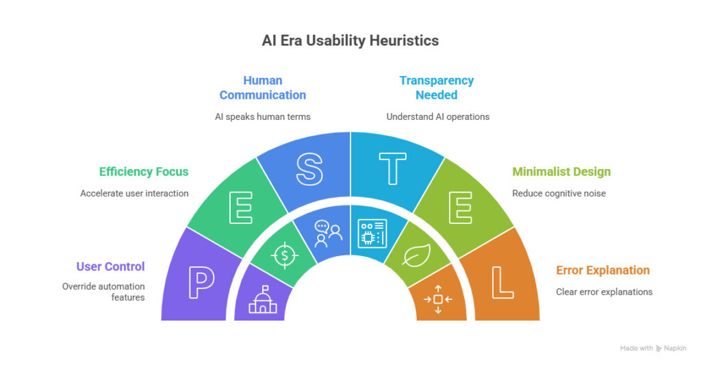
Why These Heuristics Still Matter in the AI Era
As artificial intelligence transforms our digital experiences, Nielsen’s heuristics remain remarkably relevant — perhaps even more so than before. Here’s why:
AI Transparency
AI systems often operate as “black boxes.” The visibility heuristic reminds us to make AI operations transparent and understandable to users.
Human-AI Communication
The match between system and real world becomes crucial when designing conversational interfaces and ensuring AI speaks in human terms.
Control Over Automation
As AI makes more decisions, user control becomes essential — people need ways to override, adjust, or disable automated features.
Error Explanation
When AI makes mistakes (which it will), users need clear explanations of what went wrong and why, in non-technical language.
Common Mistakes Designers Make
Even experienced designers can fall into usability traps. Here are some frequent missteps to avoid:
⚠️ Common Pitfalls
- Ignoring feedback loops — Failing to acknowledge user actions or system processes
- Prioritizing aesthetics over usability — Creating beautiful but confusing interfaces
- Using clever language instead of clear labels — Sacrificing clarity for creativity
- Inconsistent navigation patterns — Changing how users move through the interface
- Burying important information — Making users hunt for what they need
✅ Best Practices
- Test with real users — Validate assumptions with actual user testing
- Balance innovation with convention — Innovate where it adds value, not everywhere
- Design for accessibility from the start — Inclusive design benefits everyone
- Prioritize performance — Speed is a fundamental aspect of good UX
- Iterate based on data — Use analytics to continuously improve
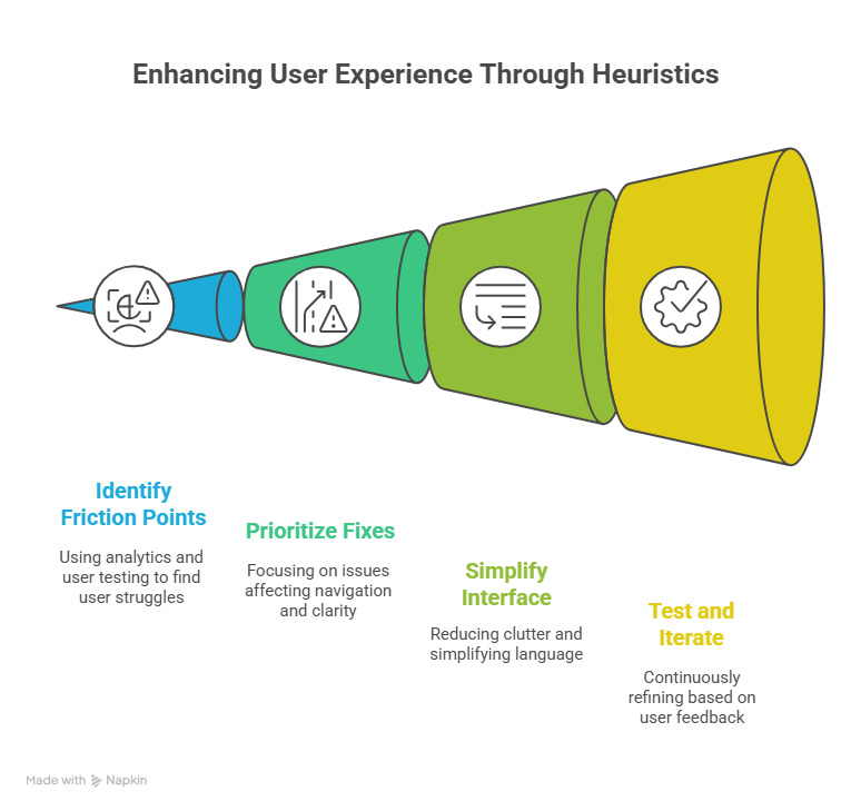
Step-by-Step Guide to Applying the Heuristics in Your Projects
Turning theory into practice can be challenging. Here’s a practical approach to implementing Nielsen’s heuristics in your design process:
-
Conduct a heuristic evaluation
Systematically review your interface against each of the 10 heuristics, noting where it succeeds or fails.
-
Identify friction points using analytics and user testing
Look for areas where users struggle, abandon processes, or report confusion.
-
Prioritize fixes that affect navigation and clarity first
Focus on issues that impact core user journeys and fundamental understanding.
-
Simplify language and reduce visual clutter
Edit ruthlessly to focus the interface on what truly matters to users.
-
Test again — iterate and improve continuously
Usability is never “done” — continue testing and refining based on user feedback.
Pro Tip: When conducting heuristic evaluations, involve multiple evaluators with different perspectives. Research shows that different evaluators tend to find different usability problems.
Real-Life Success Stories
Let’s examine how leading companies have applied Nielsen’s heuristics to create exceptional user experiences:
Airbnb: Visibility & Error Prevention
Airbnb refined its booking flow by improving visibility of system status and implementing smart error prevention. Their calendar clearly shows available dates, prevents selecting invalid date ranges, and provides immediate feedback during the booking process.
Slack: Consistency & Flexibility
Slack balances minimalism with flexibility by using a consistent design language while offering powerful shortcuts for power users. Their interface remains clean and focused while providing keyboard shortcuts, slash commands, and customization options for advanced users.
Tools, Books & Resources
Ready to deepen your understanding of usability heuristics and put them into practice? Here are some essential resources:
Essential UX Design Books

Don’t Make Me Think
By Steve Krug
The classic guide to intuitive navigation and information design, with practical wisdom for creating user-friendly websites.
Price: $30-35

The Design of Everyday Things
By Don Norman
The foundational text on human-centered design principles that apply to both physical and digital products.
Price: $17-22

Designing with the Mind in Mind
By Jeff Johnson
Explains the psychology behind usability guidelines, helping designers understand why certain approaches work better than others.
Price: $45-50
Usability Heuristics Checklist
Use this checklist to evaluate your own interfaces against Nielsen’s 10 heuristics:
- ✅ Visibility: Does the system always keep users informed about what is happening?
- ✅ Real-World Match: Does the interface speak the users’ language with familiar concepts?
- ✅ User Control: Can users easily undo actions and exit unwanted states?
- ✅ Consistency: Do similar elements and actions work the same way throughout?
- ✅ Error Prevention: Does the design actively prevent errors before they occur?
- ✅ Recognition: Are options visible rather than requiring users to remember them?
- ✅ Flexibility: Does the interface work well for both novice and expert users?
- ✅ Minimalism: Is the design free of unnecessary elements that could distract users?
- ✅ Error Recovery: Do error messages clearly explain problems and solutions?
- ✅ Help: Is contextual help available when users need additional guidance?
Conclusion
The best designs don’t shout — they listen. Jakob Nielsen’s 10 usability heuristics remind us that great design is empathy in action. By understanding how users think, perceive, and interact with digital interfaces, we can create experiences that feel intuitive and effortless. This means not only considering the aesthetics of a design but also how it resonates with the user’s mental models and expectations. A well-designed interface anticipates user needs and minimizes friction, allowing for a seamless journey through the product.
As technology continues to evolve with AI, voice interfaces, and immersive experiences, these fundamental principles remain our compass. They guide us toward designs that respect users’ cognitive limitations, align with their expectations, and ultimately, make technology more human. For instance, as we integrate AI into our products, understanding user behavior becomes even more critical. The heuristics help ensure that as we innovate, we do not lose sight of the user experience, keeping our designs accessible and user-friendly.
When users interact with your product, do they feel understood—or overwhelmed? The answer often lies in how faithfully you’ve applied these timeless heuristics. A design that incorporates feedback loops, provides clear navigation, and offers support can significantly enhance user satisfaction. In contrast, neglecting these principles can lead to confusion and frustration, undermining the very purpose of the technology.
“Usability is not a surface gloss that can be applied at the last minute. It’s a fundamental aspect of product design that begins with understanding your users and respecting their abilities, limitations, and preferences.”